Background
Looking around in your house, looking for items such as keys, remote, phone - everyone probably has had that moment before. According to the study, people spend 3,680 hours on searching for items in their lifetime. This project aims at delivering a new user experience in which people can easily track down items in home. We were challenged to design experiences around IoT, utilizing the technology, Ambient backscatter. The technology has several unique advantages. As a UX designer, my role in the team is to come up with an effective and efficient use of the technology based on solid user research.
Tracking items is one of the emerging topics in IoT. Several new products have rolled out in the last few years. Most of the products target at tracking down valuable items such as keys and wallets. The products work well for certain types of items but they are not effective enough for items which you look for on a daily basis such as a remote because it takes time to locate an item with a mobile app. We identified different types of items which people want to track in their home, and also scenarios which aren't adequately supported by existing products.
Technology
Ambient Backscatter
This project is sponsored by Professor Joshua R. Smith who is a professor at the University of Washington. He asked us to explore applications of the technology around home. Ambient backscatter has a couple of significant advantages. Firstly, it’s battery-free. You don’t need to maintain it at all. Secondly, the technology doesn’t need a reader which is necessary for RF communication. Finally, the manufacturing cost is quite low so devices can be sold in batches unlike existing products like Tile, which costs roughly 25 dollars each.
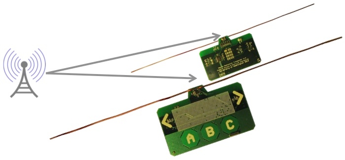
(The image is from here.)
User Research
Competitive Analysis
In order to experience tracking items with existing products first-hand, each member in the team tried out the products. By doing so, we could actually identify some problems that the existing products don't effectively address. Also, we now can see some opportunity spaces around the existing products, which we could explore with our technology.
Our team looked at existing consumer products that utilize wireless communication technology to track or locate items. There are a number of existing products that help track valuable items. The big players are Tile, Chipolo, and TrackR. Those products basically use Bluetooth Low Energy (BLE) as its core technology to locate an item. Since they use the same technology, the size of the products are almost the same. The differences are design and apps. As opposed to Tile which doesn't have a color choice, Chipolo has different color options. TrackR has some add-ins. For example, one of the add-ins is to make TrackR water resistant. All the products come with an app to track an item on a phone. The apps are very different among the products.
We ordered 5 kinds of tracking products, Tile, Chipolo, TrackR, StickNFind and Duet. We actually tried out the products for a couple of months in order to experience how the process of tracking items is supported by the products.
Field Study
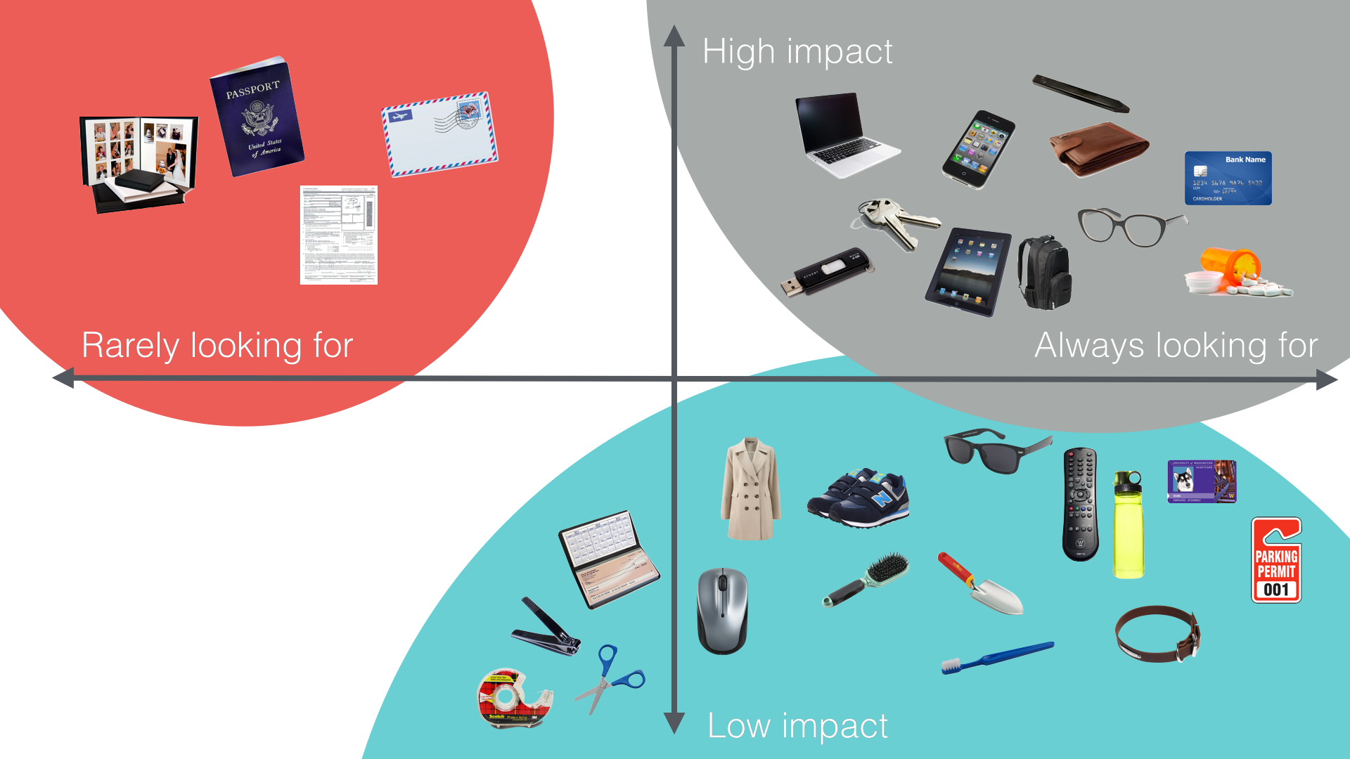
We conducted field studies with a combination of techniques, contextual inquiry and participatory design. In order to identify items people want to track in home, we created a very low-fidelity prototype as a form of stickers. We asked participants to tag items with stickers. A couple of days later, we visited their home and went through all of the items they tagged. We asked about reasons why they tagged, to identify scenarios. From the field study, we identified there are three spaces that home items are categorized in terms of impact people would have if they lost items and value of items. We also identified some scenarios in which people need to track items. The most common scenario is that they tag a valuable item because they don't want to lose it.
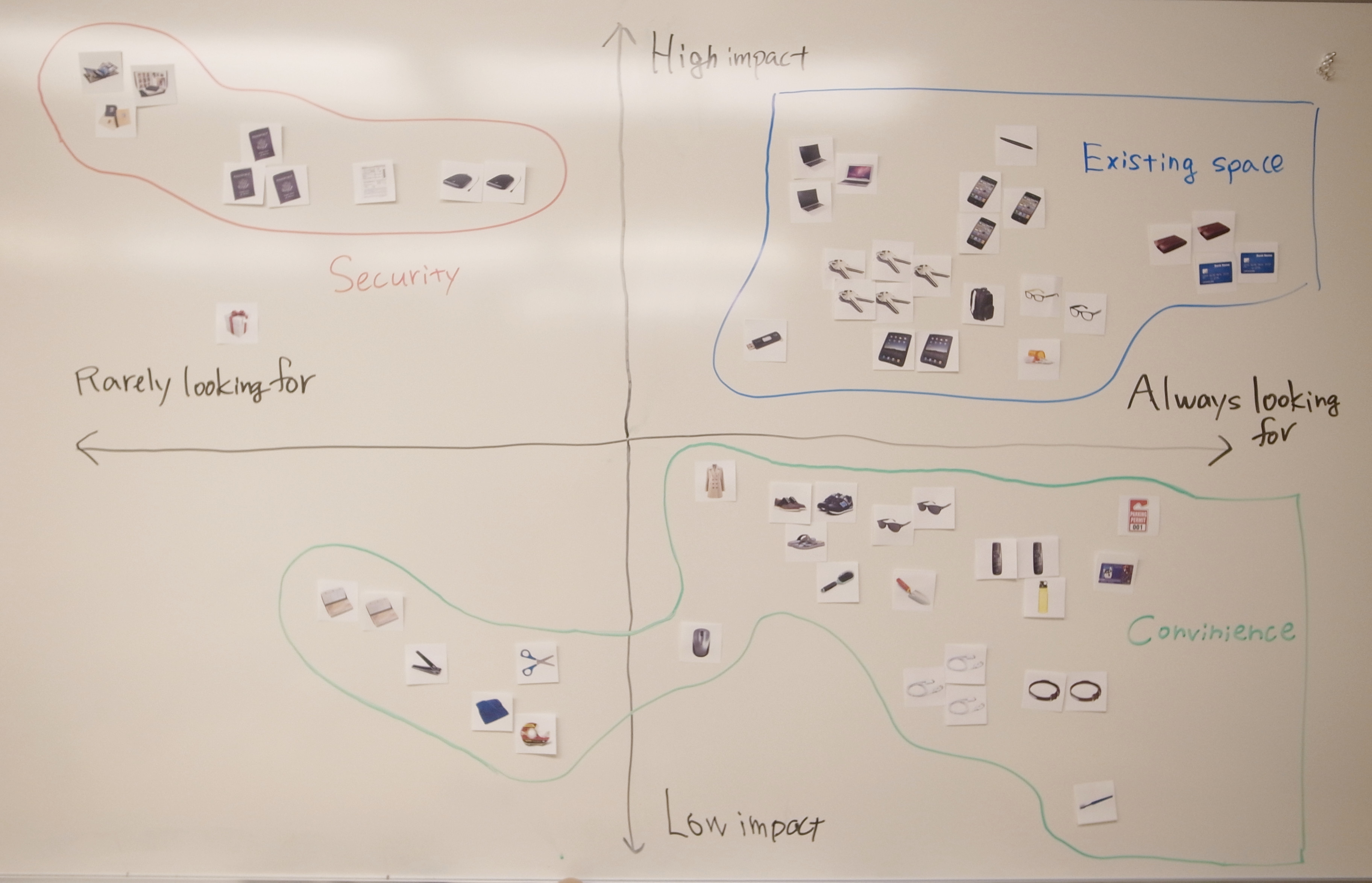
From the framework, we identified that home items are grouped into three spaces. The first one is about convenience. Those items are frequently looked for but have low value. The second one is about security. Those items have high value and people want to keep them safe. The third one is an existing space. The items in this space are the ones which are targeted by existing products. Usually those are replaceable but it's cumbersome or costly if they are lost
Ideation
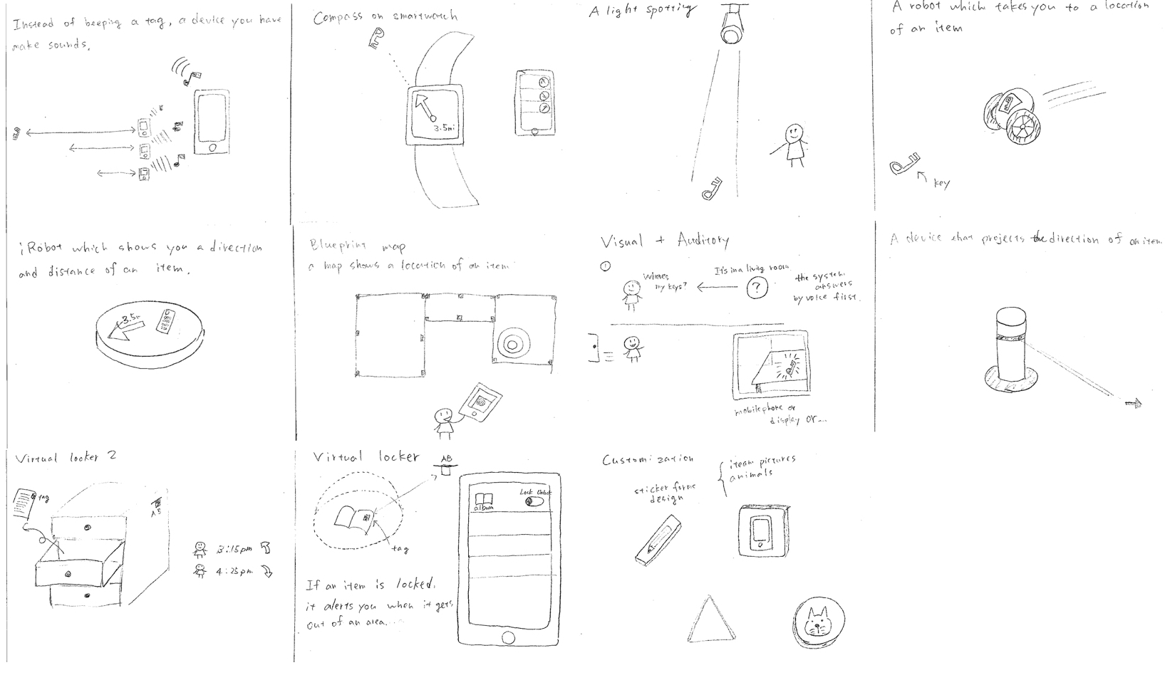
Brainstorm drawing
With the field study findings in mind, each of us came up with 10 ideas which have potential to solve problems or improve current scenarios. We individually brainstormed first to use our time effectively, and then we got together to discuss our own ideas. We collected all of our ideas together, and then discussed all of them one by one. After that, we grouped them into several concepts. We discussed each concept considering advantages and disadvantages of Ambient Backscatter.
Concept
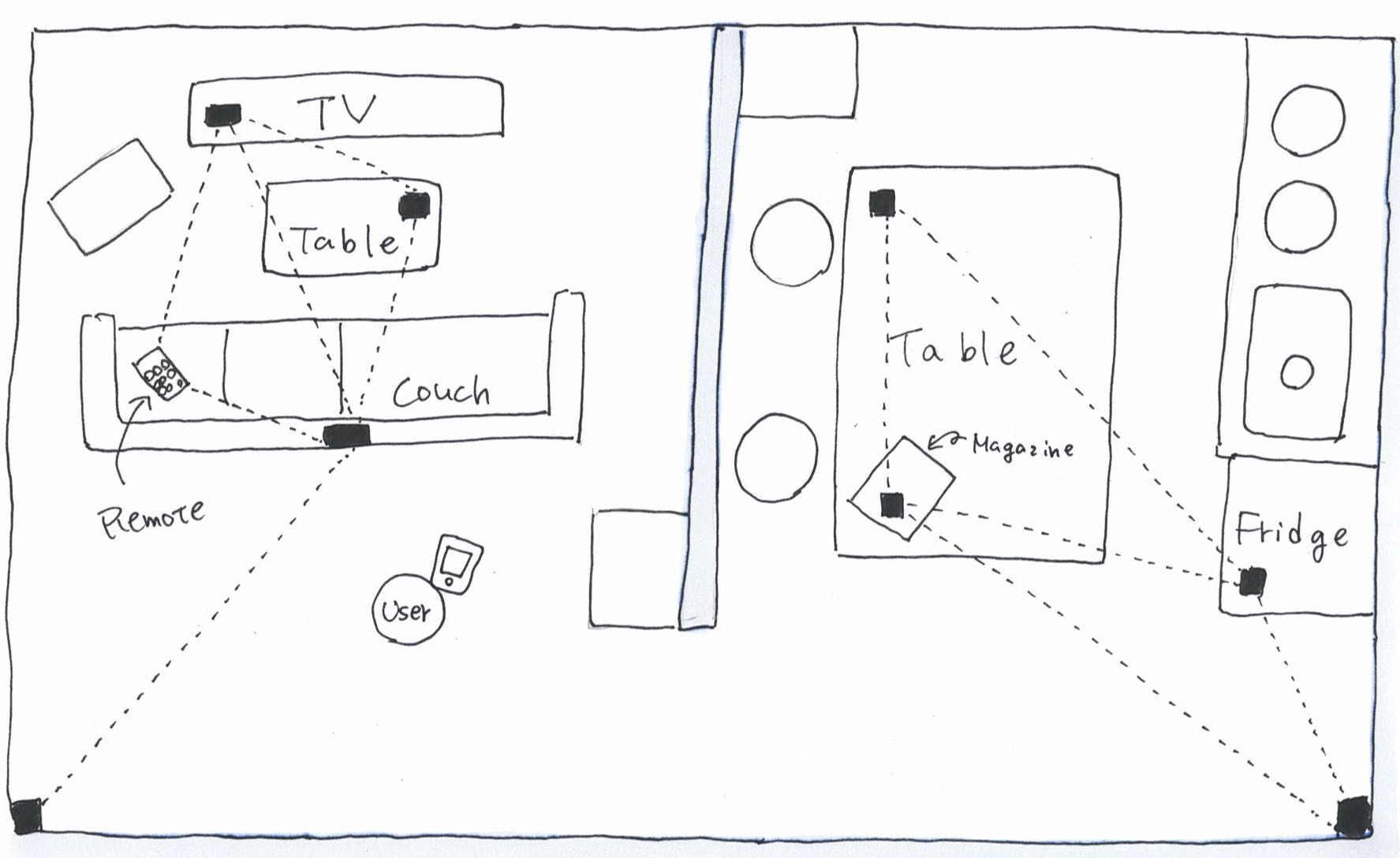
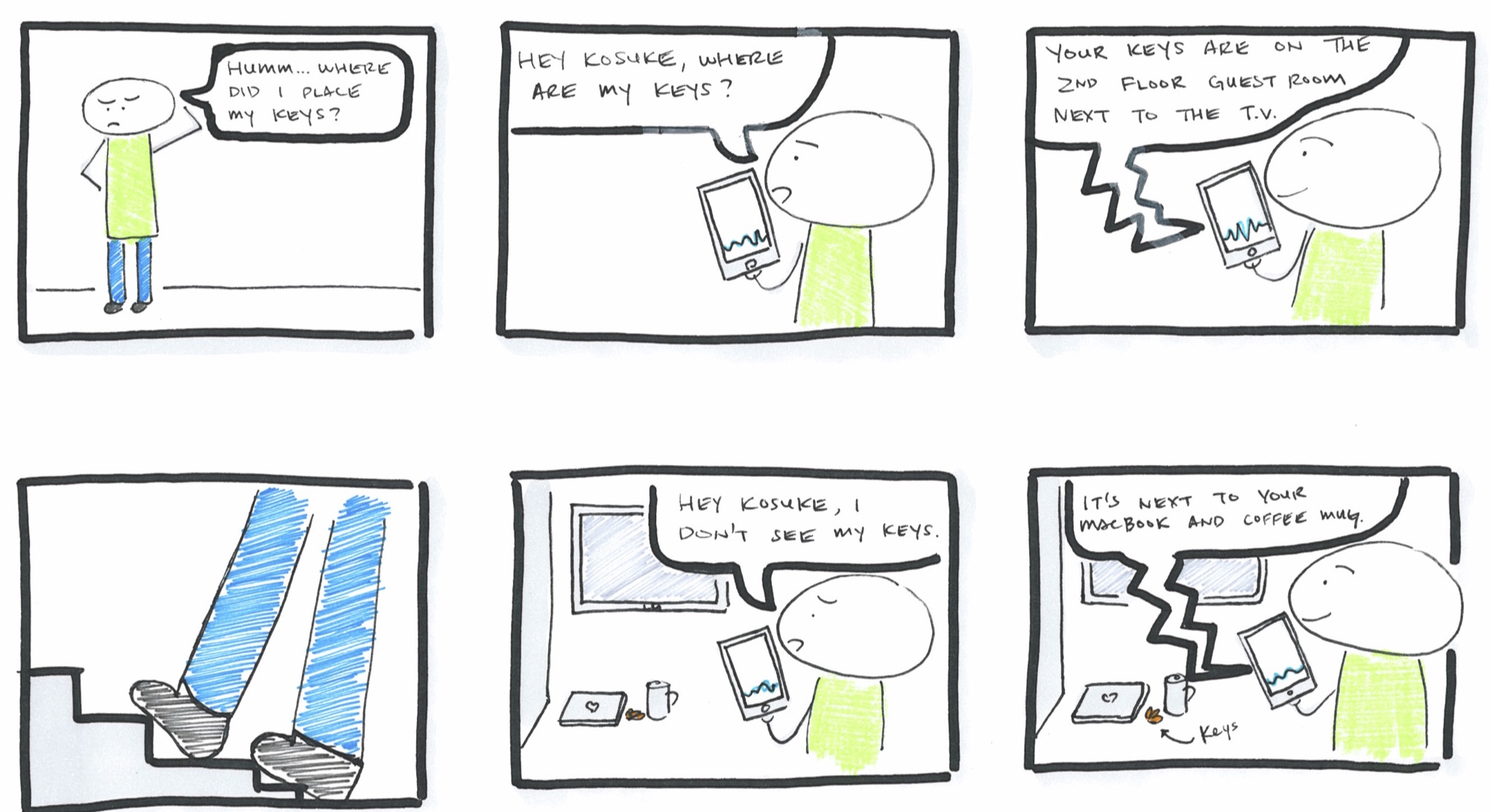
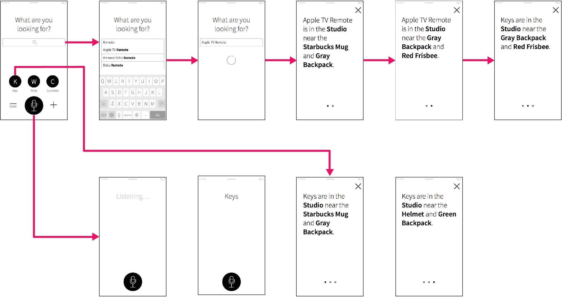
In the field study, we found that convenience is important for certain items. People might not even look at a phone to locate items, which is one of the limitations in existing products. This finding led us to come up with the idea to use voice to activate the system. The user talks to the system asking "Where's my keys?", then the system tells the user where the keys are. The purpose of using voice is to reduce steps which the user has to take to interact with the system. The idea has another unique concept. Since Ambient Backscatter devices can communicate with each other, the system is able to know relative positions of all the tagged objects. This allows the system to answer back to the user "Your keys are close to the television," which is totally different from the way of tracking down an item with existing products. This might be more natural to humans since we often ask someone like above when they cannot find a misplaced item.
Storyboard
Prototype and Evaluation
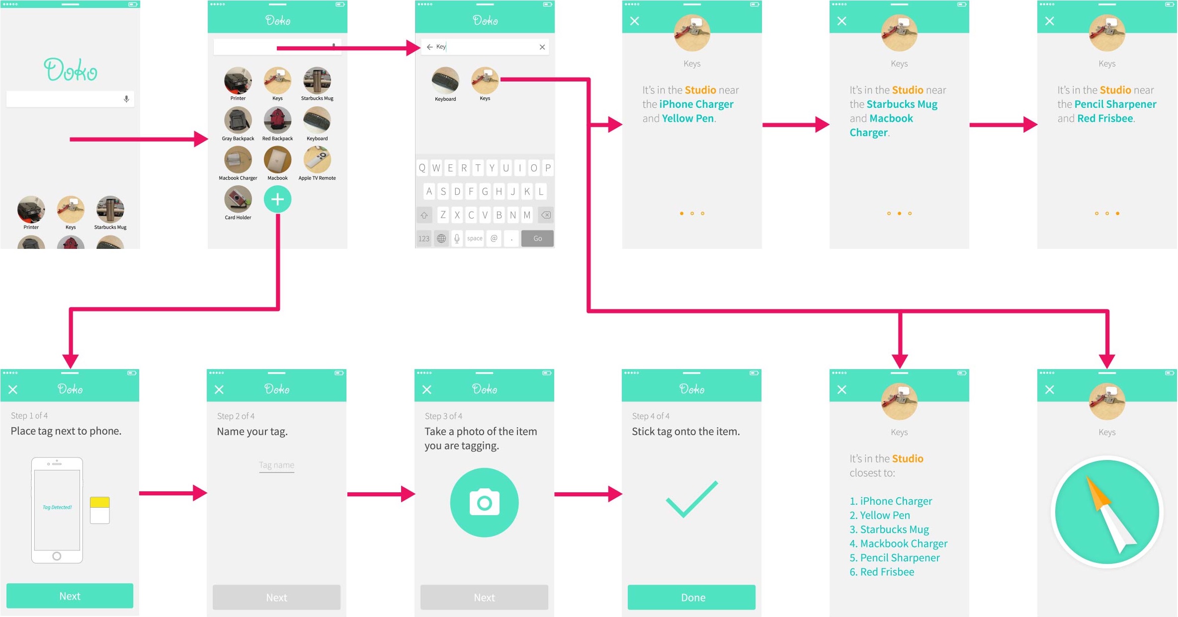
After we had an idea for our concept, we roughly sketched out UI screens in a brainstorming session. The process was more like brainstorming rather than designing screens. In the prototype step, we created three prototypes in total, UI sketches, wireframes and mobile screens.
RITE method
We employed the RITE method, which stands for Rapid Iterative and Testing method for evaluation. For each prototype, we refined them after an each usability testing session. The method allowed us to quickly find out some of the major usability problems in a limited time frame. We conducted 5 usability testing sessions with 5 participants. In the first round, we tested our wireframes with 3 subjects. In the second round, we tested our mobile screens with 2 subjects. The testing was conducted in a way we asked participants to actually locate an item in a controlled lab setting, using a prototype.
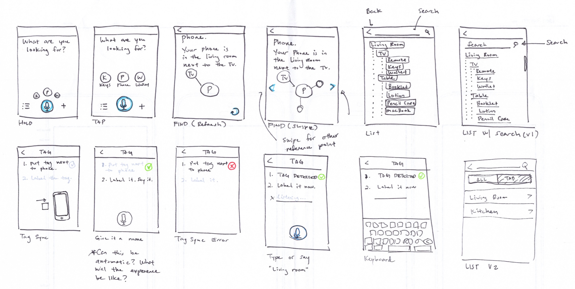
Wireframes
Design comps
